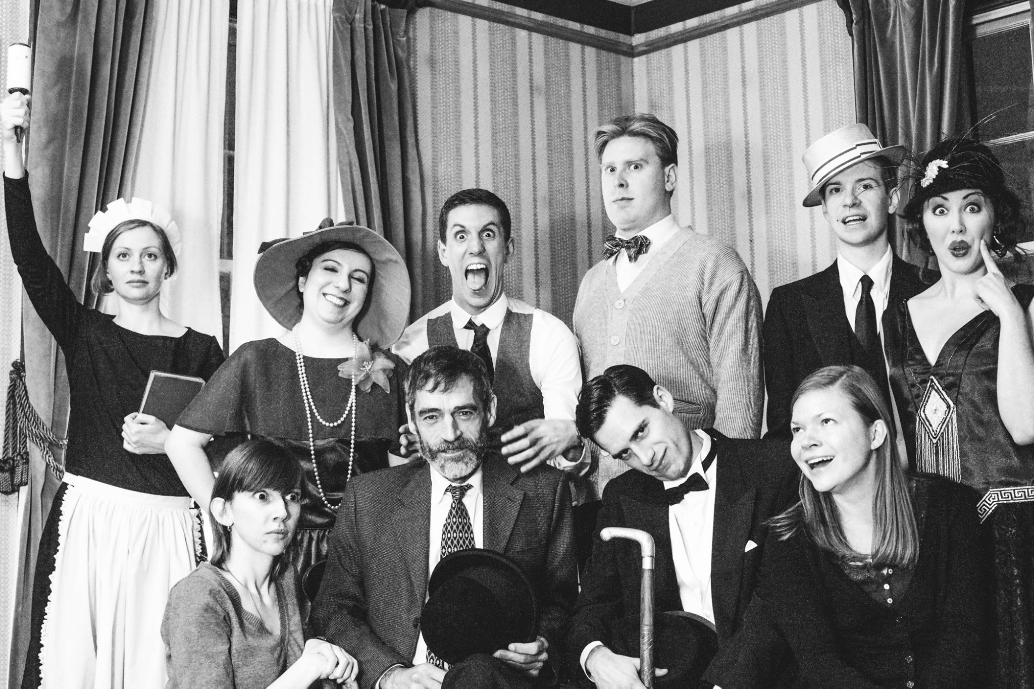
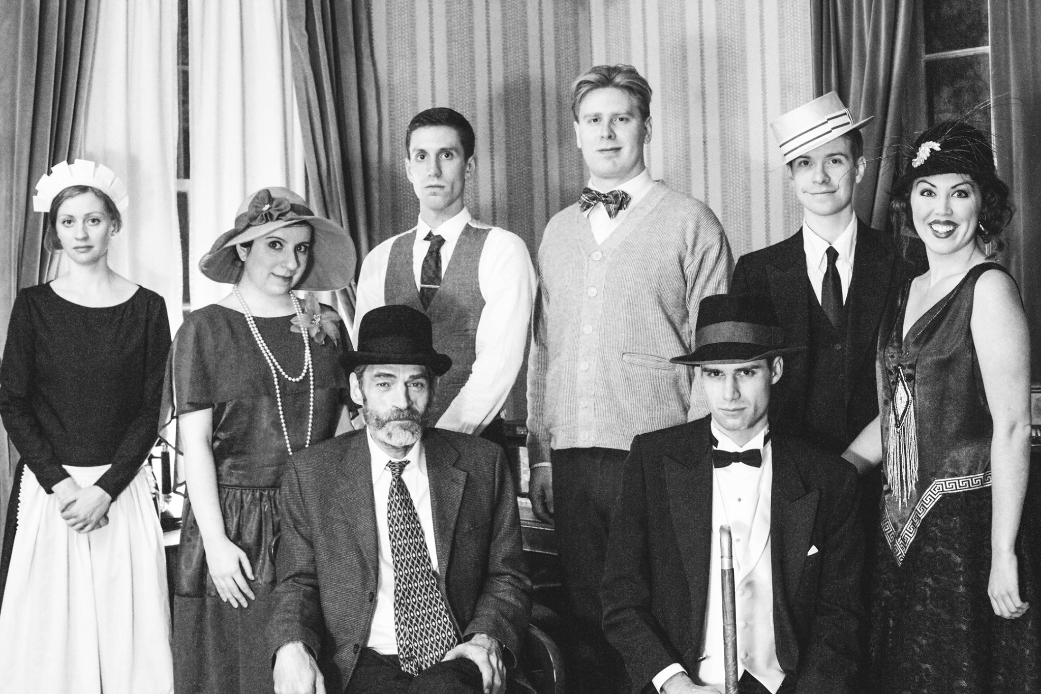
I usually try to do posts throughout rehearsals and leading up to a show but this past month has been too busy. On top of my work at Tarragon and rehearsals for Wait Until Dark, I have been prepping for Vaudeville Revue, have run another Retro Radio Hour, and moved into a new apartment only 2 weeks before opening. Now that the dust has settled, I’d like to go back and highlight some of the work that went into the show, starting with one of my favourite things, prop food.
I’ve done a post on vintage labels before, a brief one that highlighted using public domain images and another with the focus on old liquor labels, but what I needed for WUD was a little different.
A key piece to the set was a fridge, and knowing it would have to be open a lot, I wanted it to be stocked full of vintage goodies. As well, there is a point in the show where the characters have emptied everything out searching for something, and I need some things to make a mess with – seeing a kitchen as half of the set, I figured food and cleaning supplies as the way to go.
As often happens I planned more props than I actually had time for, but as these are relatively easy to make I may just make this one of my evening hobbies, maybe build a faux cereal box while the BF is watching football or something. At any rate, here’s a few tips if you’re looking to do some retro prop making of your own.
1. Decide on a decade
I’m a little odd. I often pick an exact date for my show and go to great lengths to make sure that everything in it is VERY period accurate – it goes without saying that this is not necessary, simply narrowing down a decade (or part of a decade) is enough to give the feel of the period, and what’s more important than knowing the EXACT date you’re looking for is knowing what’s characteristic of that time.
See the Rice Krispies packages above, ranging from 1928-1984, the key change is the introduction of the elves and addition of bolder, brighter colours that would be more attractive to children. The image on the far left is from 1928, and the font-only package existed only a few years, as the elves were created in the early 1930s. However, if you were dressing a set for a play in the 30s, or if you were looking to dress an adult’s kitchen, you may want to use that style box a bit past when it was really used, as it immediately reads as old and has a great no-nonsense, grownup style. In the same vein, if you wanted to create a family kitchen, you would likely look for some “children’s cereal” and source some boxes with a fun cartoon character, like the third one above from 1965.
2. Narrow down a style & colour scheme, OR decide on the types of products your characters would buy
Another important decision in regards to your props is whether they are there to just enhance the look of the set, or if they are meant to add to the story or character. If, for example, you were going for something stylized and wanted a wholly monochromatic set, you could search for period packaging to fit your colour scheme.
Google makes this very easy. Go to images, search tools and you will see a dropdown for colour; the images above show what comes up for “retro packaging” with no search filters, and then with selected colours. Makes for a very easy starting point.
Of course, no one’s cupboards are really all colour-matching, and so if you are going for realism you will want to think more about the products themselves. Does your character buy only the best? Maybe they want a discount brand, or something in bulk. Do they clean with just water and vinegar or do they have all the latest cleaning supplies, one for everything that could possibly need to be disinfected? Give it some thought and you will make for a very authentic and interesting set.
3. Search for hi-res images, or simple designs
If you are looking to print off labels you find online, you want to be sure you have a high quality image, otherwise you will end up with something blurry or pixelated and that will distract from, rather than enhance your set.

Check out sites like Etsy for hi-res scans of old labels, and browse for Flickr accounts by collectors as well. I have yet to find a really good, comprehensive collection of labels by decade, but I feel like there is one out there, and if not, I think I need to make one. Some companies that have been around a long time, like Hershey’s, have a history on their website, and that can be a good resource as well.
If you are unable to find enough high quality labels, look for a simple design that you can edit easily in photoshop. The labels above use complex design and typography, and would be difficult to replicate without some pretty serious artistic skill. However, many packages use simple colours and fonts, and with a few minutes of editing can be made into something passable, if not something very authentic. That is in part why I chose Dreft as one of my packages; greta retro colour, very simple design.

4. Source forms
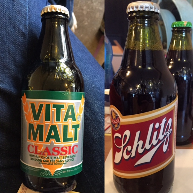
After you’ve decided on the labels you want, you need to find the forms to build them on. Existing cereal or granola boxes are an easy start, and you can always edit your label in photoshop to match the dimensions (like I did). Alternatively, you could build one yourself and finally use your grade-school geometry training, but honestly I think that takes more time than it’s worth. When looking for something like beer bottles remember that the shape used to be different, shorter and wider, and while it’s unlikely audiences will look at a bottle and say, hey! that’s not the right shape for that decade! when it is right, people do tend to notice. I managed to find something called “Vita Malt” (sounds yummy, eh?) that had just the right shape, AND the right dollar store price.
5. Remember the magic of theatre
While I always aim for film-quality props, the magic of theatre is that you are generally far from the audience and under bright lights, two things that help to blur some details and let you get away with less-than-perfect props onstage. Found a great old label but it’s scanned from a crumpled original? No worries. Throw it in photoshop and paint out the details, fix only the logo and no one will notice if it’s missing some extra info. Want to alter the colours slightly to better match your set? Go for it. Up the saturation & contrast, adjust the hue, go crazy, no one is going to notice the change but they will notice the final effect.
After you’ve found your forms & your labels, you’re ready to build, a fairly simple process but there’s a couple important things to remember if you want to really nail the look – I’ll go over these next time. For now, goodnight.
-E.