Vintage Finds – Radford Family Bible

Standard

Next to antiques and theatre, my third greatest passion is likely genealogy. Over the last few years I’ve spent a lot of time researching my own family history, and knowing the joys and frustrations that come with it have made me bother to take the time to document anything I come across in my own vintage/prop hunting that may be of interest to other family history buffs.

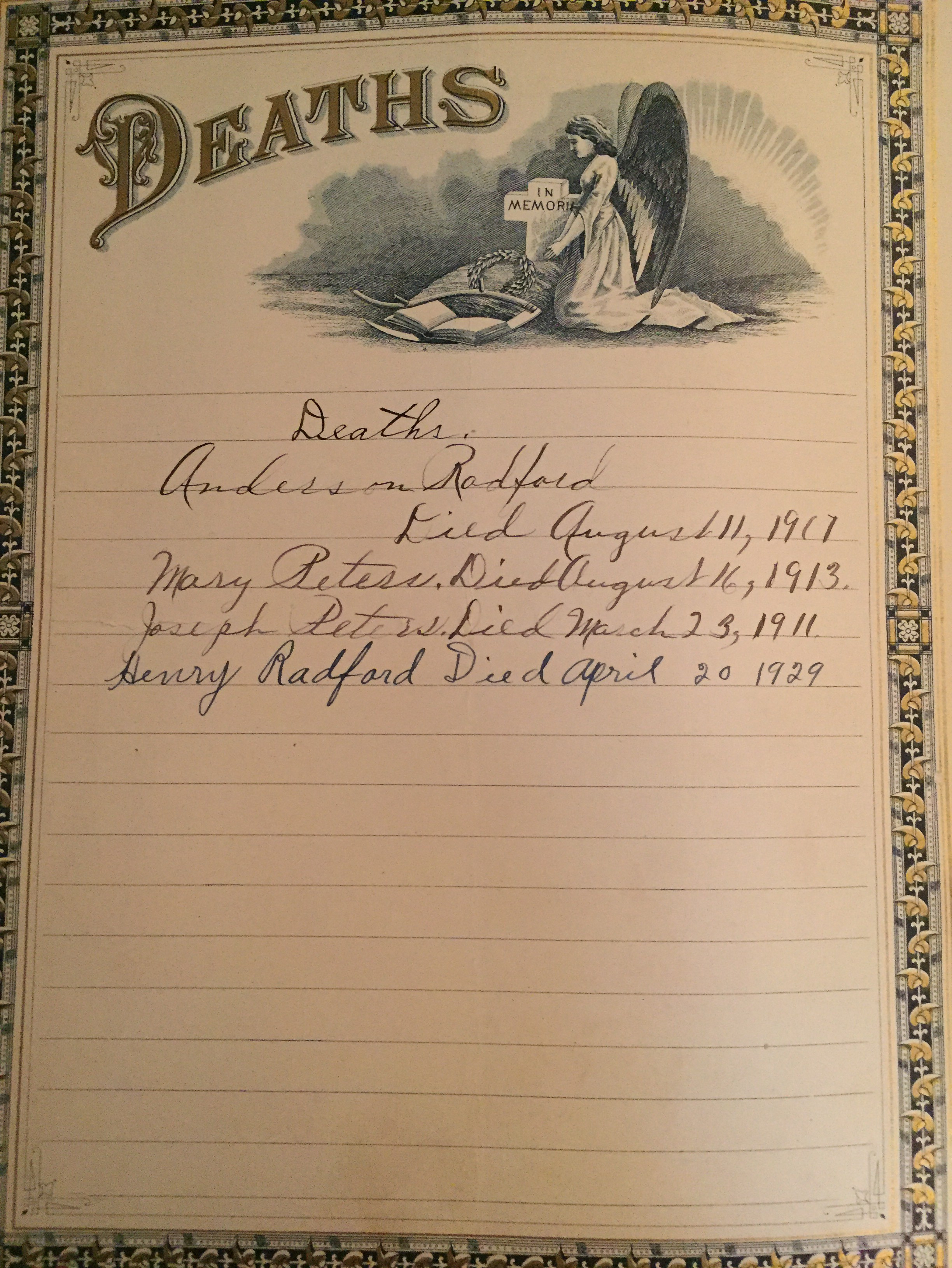
My most recent acquisition for Bygone Theatre’s upcoming show (join us September 24th to find out what that is) was an old family bible. While the cover is falling off and the pages are foxed and worn, it still contained some interesting pieces of history, that might be useful to anyone researching a Radford family from Huntington W. VA.

I’m including here the photos I’ve taken of selected pages from the bible; if this is part of your family tree, please let me know. I don’t have any additional information but after this year’s show, I’d be happy to send it along to someone who it would have meaning for.

Note: it was obtained from an estate auction here in Toronto, Ontario, Canada, which likely means that a relative owned it. However, there are people out there like myself who just collect old things for fun, so I can’t be certain, but it may be a helpful link.

IMG_1946

Agnes Anderson Radford, Julia Radford, Gilly Radford, Welland Radford, Henry Radford, Stella Radford, Nellie Radford, Henry Douglas Radford,

img_1955.jpg

Anderson Radford Julia Peters, James English Julia Radford,

Anderson Radford, Mary Peters, Joseph Peters, Henry Radford

Mrs Anderson Radford Receipt

Nellie Radford Perfect Attendance


What Is It? A Guide to Some Key Vintage Terms

Standard

When you’re interested in antiques but just getting started, the vast list of new terminology can seem a little daunting. Here’s a handy breakdown of some key vintage terms you’ll see if you are interested in vintage and antique collectibles (one on types of fabric, coming soon).

Composition

Commonly Found: in vintage & antique dolls, popular from 1870-1930s

What Is It?:
what it sounds like, a composition or “mix” of various materials, commonly sawdust and glue. Each company had their own “recipe” that would be kept secret, but other materials included glue, glycerin, zinc oxide and Japanese wax. This could be molded into shapes like heads and hands.

Why’d They Use It?: prior to the creation of the “composition doll”, most doll manufacturers used porcelain or bisque. The main problem with this was that the dolls were very fragile. Often heads were made of porcelain or bisque to obtain realistic features, while the body, arms, and legs were made of cloth. With the invention of composition, the limbs, and eventually torso, could be molded into a realistic form as well. All in all, it made for better looking, longer lasting, dolls.

How To Identify It: flaws are the easiest way to identify this type of material. If you don’t already have clues like manufacturer or production date, try looking for things like “crazing”, a series of fine cracks that tend to occur on the surface over time. If chips or cracks have occurred on your doll, you may be able to see a material underneath that looks somewhat like cardboard or particle board; this can be a clue to composition. Most composition dolls either have molded hair (eg. made of the same material, a solid “hair” that is part of the head) or wear a wig; if your doll has rooted hair (eg. the way Barbie does, with hair coming out of the scalp) it is likely plastic. For a detailed breakdown on how to identify composition dolls, read this article.

Bisque

Commonly Found: in antique dolls, popular from 1860-1900. Frequently made in Germany or France. When used to make modern dolls, they tend to be aimed only at the collector’s market.

What Is It?: essentially just unglazed porcelain. While porcelain or “china” dolls will have a glazed, glossy, look, bisque dolls have a matt, more life-like appearance.

Why’d They Use It?: porcelain dolls already had a following when companies began to manufacture bisque dolls. While made in essentially the same way, they  had a more realistic look than the white-faced, glossy porcelain dolls, and that appealed to more modern audiences.

How To Identify It: chances are you’ve seen and felt a porcelain doll before, and again, bisque is very similar. Unlike plastic, it will be completely solid and unbendable, and will be thinner and more delicate than most materials. A light test is the best way to identify it and to check for damage; shine a light through it (from the inside as well as out, if possible) and you should be able to see it glow. This will also light up and cracks, flaws or repairs. If you tap it, it will make a sort of “ring” sound (be gentle!), and you’ll find that porcelain and bisque will be very smooth and capable of fine detail. If you know the date or manufacturer of the doll, use this to find out for sure.

Chalkware

Commonly Found: inexpensive vintage figurines, carnival giveaways or small decor items. Sometimes called “carnivalware”. Popular in the 19th century, from 1910-1940 it evolved into primarily garish figures of pop culture icons and cartoonish animals sold at fairs.

What Is It?: molded plaster of paris or gypsum, often colourfully (and poorly) painted with watercolours or oil paints.

Why’d They Use It?: it was an inexpensive alternative to popular ceramic figures, like those made by Staffordshire.

How To Identify It?: early examples were often idyllic peasant figures or fruit. Look for shepherds, sleeping animals or nativity scenes. Pieces were hand-painted, sometimes in realistic detail, though later often looking rushed and inexact. Pieces are rarely glazed. Chalkware is hollow but will have a heavy base to keep the piece from tipping over. Look for mold lines; while the pieces would be fused together and then sanded before painting, gazing in through the bottom may allow you to see the seams. As well, most chalkware is marked with the design number, year, and copyright date, and may also have a company name inscribed. Chalkware is known to chip, crack and flake over time. The chalkware from the 1910s-40s is easy to identify by its gaudy appearance in addition to all the previous methods (really, just look at those!).

Bakelite

Commonly Found: vintage costume jewellery, radios, telephones, flatware handles, game pieces – you name it! If it’s made of plastic today, there’s a good chance it was one point made of Bakelite. See this site for a great breakdown of popular and highly collectible pieces.

What Is It?: an early plastic resin with the ability to withstand high temperatures. Invented in 1907 and popular until the 1950s, it is celebrated for its wide range of bright colours. Hard enough to cut and polish, carved Bakelite was popular as well. Most commonly solid, opaque colours, some translucent pieces were made as well and given names like “Root-Beer” and “Cherry Juice”.

Why’d They Use It?: as already mentioned it was extremely versatile, at least compared to the products available before it. It was originally used for industrial purposes due to its ability to withstand heat, and the fact that it was colourful and carve-able made it a popular choice for artists.

How To Identify It: there are many methods to identifying Bakelite, and once you’ve seen a few pieces you’ll find your eye being drawn to them right away. First off, check for seams; unless it is made of multiple colours, there shouldn’t be any visible. Hardware on something like a brooch should be embedded or riveted on, as opposed to glued. As with many of the items discussed, flaws can be the best way to identify the “real deal”. Chips should reveal the same colour underneath; if you see white, something’s not right. Carved pieces may have small chips along the edges that shows the tool that was used to create them. As I mentioned, Bakelite has a very distinctive look, a particular shine and smoothness to it. This is described very well in this blog. Unlike modern plastics, or other vintage materials like Lucite and Celluloid, Bakelite tends to be quite heavy. When you tap a couple pieces together, they make a distinctive, low-pitched “clack” sound. Finally, due to it being made partially out of formaldehyde, you can test Bakelite by smell. Give it a rub, or run it under some warm water and it should reveal its tell-tale, chemical scent. For more tips, and for info on how to clean and care for Bakelite, check out the Vavoom Vintage site.

Lucite

Commonly Found: 1950s costume jewellery, retro shoe heels, purses, lamps.

What Is It?: a clear acrylic plastic created in the 1930s, popular in the mid twentieth century, and still in use today.

Why’d They Use It?:  Lucite was less expensive to create than Bakelite, and more versatile than Celluloid, leading to it eventually dominating the market and making those earlier plastics obsolete. While it starts clear, it can be dyed a wide range of colours, and can be carved and polished, like Bakelite. Cabochons were made to imitate jewels, and bold costume jewelry was manufactured out of it throughout WWII. The material was also used to serve the war effort, being made into periscopes, windshields, and the noses of bomber planes.

How To Identify It: Lucite can look very similar to Bakelite, but goes for far less. Both these plastics are Thermoset, meaning you cannot melt it down to make something new after setting it. Many of the Bakelite tests can also reveal Lucite, however the key difference is the smell; Lucite is not made of Formaldehyde. It can be difficult to distinguish between modern and vintage Lucite, so be sure you have a good understanding of jewellery styles and colour trends; also note that most modern Lucite is solid, but opaque jewellery was available in its earlier days as well. Some vintage Lucite has a distinctive sheen, referred to as “moon glow”, and glitter inside it – referred to as “confetti Lucite” – was a popular vintage look as well. Contrasting coloured bits spread throughout the piece for a “granite” look is also a popular vintage sign, as is a coloured piece embedded in clear Lucite.

Celluloid

Commonly Found: small jewellery and decorative items from the mid 1800s to 1940s. On the backs of compact mirrors, vanity sets, razor handles, on vintage pins and holiday items.

What Is It?: a brand name type of plastic made of cellulose dinitrate blended with pigments, fillers, camphor, and alcohol to make a unique synthetic material; like “Kleenex”, it has been used to describe similar products by other companies. Sometimes referred to as “French Ivory”, although it is in no way like the real ivory that is derived from animals. Extremely flammable and prone to deterioration, products like Bakelite and eventually Lucite made it become obsolete.

Why’d They Use It?: while not the first man-made plastic, it was one of the firsts, created in 1867. The inventor, John Wesley Hyatt, created the substance when trying to win a contest. The company Phelan & Collander had promised $10,000 to anyone who could come up with a substitute for ivory, and while Hyatt did not win the prize, during his experimentation he noticed that camphor added to nitrocellulose, plasticized. Initially the substance was used for billiard balls and dental plates. The billiards, however, never really caught on due to the flammability of the material; Celluloid coated balls sometimes produced small explosions when they collided. The material was used to coat early movie film as well, and that sparked countless fires in projection rooms (this instability of the film, due to the nitrite, makes early film preservation difficult). Despite this obvious drawback, Celluloid was in many ways versatile, and was used to create inexpensive versions of items made from ivory or tortoise shell.

How To Identify It: while Celluloid may initially look like ivory, or tortoise shell, it is far lighter, and if you hold a light up to it, you are likely to be able to see through it. As with most items on this list, deterioration can help with identification; it may crumble, crack, or crystallize. Celluloid is very thin, much more so than other early plastics like Bakelite. It too can be identified through a “smell test” – rub it or run it under warm water (do NOT use a hot pin as, remember, early examples were flammable) – and you should be able to smell the camphor (eg. moth balls). Post 1927, the camphor was removed and the smell test will no longer be relevant.

Do you have any requests for other vintage, man-made materials? I’ll do a blog on natural materials and fabrics sometime soon. Leave your requests in the comments 🙂


Designing His Girl Friday, Part 1: Vintage Office Desks

Standard

While His Girl Friday won’t open for another 4 months I’m already busy prepping things on the production side. The budgets are set, fundraising & marketing scheduled, so now I get a little time to spend on one of my favourite parts of putting together a show (and part of why I started Bygone in the first place); designing.

Anyone who’s seen a Bygone Theatre production knows that we always do things set in the 20th century, and while there are of course budgetary restraints that don’t make 100% accuracy possible, I do work hard to get an authentic period feel to our shows, both with props and costumes, and when possible, set.

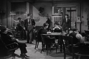
His Girl Friday is set in 1940 and takes place primarily in a newspaper office, which means that I have to find a lot of period office supplies. The good thing is, since it’s an office (as opposed to, say, the house of a trendy socialite), I can play with the time period a bit; supplies from the 30s or even 20s could easily still be showing up, as long as they do have modern necessities like typewriters and phones. So let’s start with the most basic part of an office…

Desks

There’s a few key styles of desk you will come across if researching those from the first half of the twentieth century; secretary desks, rolltop desks, typewriter desks and tanker desk.

The secretary desk is the oldest style in this list, and despite its name, would not be very useful for most secretaries, as it forces the user to sit staring into a bookshelf, rather than outward towards visitors. The base is made with wide drawers which have above them a hinged desktop surface, allowing it to be opened when a writing surface is needed, or closed to save space and protect documents when it is not. The top half of the desk features a bookcase – sometimes with some drawers – often covered by glass. All-on-all the secretary is a tall, heavy piece of furniture with a shallow depth. Once again, not very practical for a modern office, certainly not a shared space.

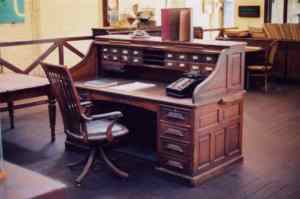
The rolltop desk was a staple of the turn of the (20th) century office. First designed in the late 1800s, it became popular throughout the end of the Victorian era as it was quite easily mass produced. Its signature element is the roll down top, wooden slats on a tambour that allowed the user to cover the desktop and drawers. While practical for a small office with minimal correspondence, the desks grew out of favour as large elements such as the typewriter required more desk space, and the small drawers and compartments grew unusable due to an increased volume of paper (again, thanks to mass production).


One of the modern marvels becoming appearing in turn of the century offices was the typewriter (I’ll go into more details on those later), and with that came the necessity for a new type of desk. Just as you would today want to have a different desk for your computer than say, writing or sewing, workers then found they needed something not only lower (for ease of typing) but sturdier than the hinged tops commonly used before; typewriters were heavy and required hard pounding on the keys. In addition to that, early typewriters were finicky and expensive, so it was important to keep them covered and safe from dirt and dust. Many initially considered them an eyesore as well, so the cover had an aesthetic value too.

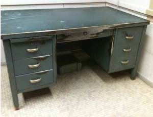
1946 saw the introduction of the Tanker Desk, a new form of the pedestal desk made of steel, with a sheet metal surface. These utilitarian style desks were popular in institutions such as schools and government offices, and have a distinctly retro feel. They remained popular until the 1970s, and are often sought after now for a “industrial” look. However, as I mentioned previously, this show is set in 1940, so these are a little too modern. Plus, they are expensive and heavy; not a great choice for a show.

So what to use? Before even doing any research I knew I preferred the look of wood desks to wooden, and I knew I would need some that could support a typewriter. This play also calls for a rolltop desk. Given that we have a budget to stick to, and keeping in mind how difficult these can be to move and store, my plan is to get a larger, slightly older desk for Walter Burns (the editor) to have in his private office, and to use a small typewriter desk for his secretary.

The reporters will likely share a large table with just their own phone and small work station, and the back of the office will have a few older desks set aside, including our necessary rolltop desk. I’ll post photos when we have them all purchased, but for now, here’s an idea of what I’m looking for;

All for now, more to come soon!
-E.

The Photo History Sleuth: My Part-Time Obsession – Part 1

Standard

As anyone who knows me already is well aware, I am a huge fan of antiques and genealogy. Recently, I’ve decided to try and put those passions to use by opening Tucked Away Antiques, an Etsy shop where I can sell some of my finds in hopes of funding more treasure hunting.

Recently I acquired a lot of vintage cabinet cards from an auction, with the only information being that they came from the estate of the late “Clarence B. Kilmer, Saratoga Springs NY”. While I purchased these in hopes of making a profit, my curiosity got the better of me, and I’ve gotten to try to trace down information about the people in the photos. I always feel a pang of sadness when I’m rooting through a box of old photos and find some with labels that I don’t have the funds to buy; I always want to reunite interested family members with their lost photos, as I hold out hope that someone may do that for me some day. I’m still on the hunt for missing leaves of my tree.

So rather than just doing all this for interest, I thought I’d walk you through the process I use to identify people in photos. It can be a lengthy one, and of course, it’s not an exact science, but if you go through things logically and systematically, it really can be like a mystery, and I think every mystery is solvable. So first things first, who was Clarence B. Kilmer?

Estate Finds: Researching the Head of the Estate

The internet make this very simple for modern day sleuthers – chances are, you can google the name of the estate and come up with enough for a starting place. If you’re really stuck, things like Ancestry.com, or your local library (yes, they still exist) can be very helpful. Census records, newspapers, land records and more can tell you a surprising amount about a person, but to start off, let’s try with google.

The first thing that pops up when searching for Mr. Kilmer, is an article on a realty site about the Saratoga Centennial. A neat little history of this gorgeous house, once belong to Kilmer, is given.

Here’s what’s relative to us:

In 1904, the property was purchased by Clarence B. Kilmer, a trial lawyer who served as President of the Saratoga County Bar Association for 19 years. He was honored in 1947 for being a 50 year member, and also served as counsel to the Saratoga Racing Association.

A civic leader, Kilmer was Director of the Chamber of Commerce, and Chairman of the City Planning Commission’s subcommittee on taxation and finance.

Clarence Kilmer was an avid sports fan. He built the Geyser Road baseball park, and was instrumental in having the Brooklyn Dodgers come to Saratoga for an exhibition game. He was President of McGregor Links Golf Club, and an officer of the Saratoga Golf Club, where he once played 81 rounds in a single day.

Kilmer resided at 722 North Broadway until his death on August 29, 1961.

This is kind of a home run. Off the bat, we know he was a lawyer for 19 years by 1904 (gives us an idea of birth date), that he lived at 722 North Broadway (can compare this to census records and get a list of family members), and that he died August 29, 1961 (can search for obituaries or death certificates, again may help with family members). As well, being such a prominent member of the community means he was almost certainly photographed for books or newspaper articles, so if we have a photo we suspect is him, we can compare it to that. Step 1 is complete! Now let’s look a little closer at the photos to see if we can spot him.

Identifying Photos: Pictures With Names

You may think that a photo with a name written on it is a home run – surely you can identify anything labeled! Well, not always. In my own history hunting I’ve come across confusing photos that use nicknames instead of a given name, which can be misleading, especially if there are multiple people in the family with the same name. For example, a man might be named John, but be called “Jack” by his friends. He may also have a cousin, Jack, who has that as a given name. Differentiating may be difficult. In my case, I have a Great Great Grandmother name Phelma who I have seen referred to (on official documents like census records and birth or marriage certificates) as Phelma, Phelina, Lena, Charlotte and Lottie. She also had a daughter named Charlotte who occassionally went by Lottie. So, while these things can be slowly sorted out when you have dates and other info to compare it to, a simple photo with a first name is not so easy. But let’s look at what we have here.

A quick glance at the photos, and style of dress shown in them, lets me know that there are several generations present (I’ll go into more detail about style of dress and how to use that to date photos in a bit). From my initial google search, I also spotted an obituary for a Clarence B. Kilmer III, so I know not to assume anyone named Clarence here is the head of the household; we’ll need to date these photos to figure that out.

I followed the obit to CBK III and learned quickly that he was the son of Clarence B. Kilmer, Jr. and Agatha Quintana Kilmer, and that he was born November 9, 1937. That date means that he won’t be featured in any of these photos, as they are mostly late Victorian, with a few that may be closer to WWI, so I can cross him out. It does let me know that his father was likely born in the early 1900s, and that could help identify him in photos. His mother’s maiden name may also be useful in identifying pictures that seem to not fit the rest.

The obit let me know his birthdate, which gives me an idea of his father’s birthdate. His mother’s maiden name may also be helpful. Older obituaries can be especially helpful as they tended to list a lot of the family, and can help link married women to their maiden names. Newer obits may prove less helpful because of today’s privacy concerns.

Now I come to a photo that I’ve found that is labeled C.B Kilmer. To determine which one he is, we need to try and date this:

c-b-kilmer

Labeled “C.B. Kilmer”

We’ll start with the other labels on it.

The photographer mark reads;

BAKER & RECORD
PHOTOGRAPHERS,
Ground Floor Gallery
448 BROADWAY
Saratoga Springs, N.Y.

So, back to google!

Google Books lead me to a copy of the Photographic Times, Vl 11, which praises the studio and mentions how they have taken the likeness of many prominent residents. This volume was published in January 1881. Further searching brought me to volume 13 of the same publication, published in January of 1883, where it is reported that the studio has dissolved. So, this photo can’t be from any date more recent than the end of 1882. We know that C.B.K. Jr. had a son in 1937, and so this is clearly too old to be him; looks like we’ve got our patriarch, Clarence B. Kilmer.

A recent obit gives the birthdate of C.B.K. III, which helps us guess the approximate birthdate of his father, C.B.K. Jr., and a quick search of the photography studio that took the photo labeled Clarence B. Kilmer has confirmed the photo can’t be more recent than 1883.

A little over-complicated? Maybe. Frankly, one look at it and I was pretty certain this was our man, but these same methods can be used to identify more complex mysteries, and I suspect we’ll come back to them.

I’ll use this photo to compare to unidentified men, and see if we can’t find more of them. But for now, let’s stick with the labeled pictures, and move on to his wife.

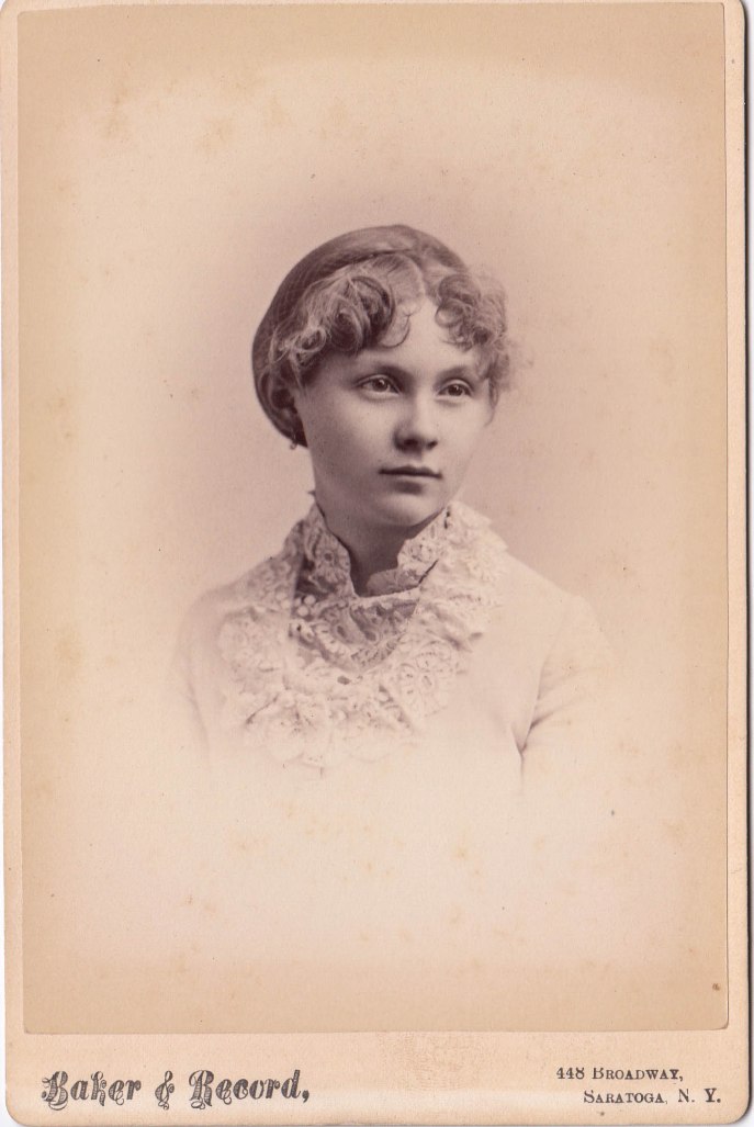
bessie-kilmer

Labeled “Bessie Kilmer”

I have 3 photos labeled “Mrs. C.B.K.” and one that reads “Bessie Kilmer”. The one labeled Bessie has a date printed on it, 1890. I found this a little odd as the woman in this photo is older than in the other ones, and yet she is not described as “Mrs. C.B.K.”. It is common to find records, be it photos or otherwise, of married women that disregard not only their maiden name, but their first name as well; one of my distant relatives was recorded on her death certificate as “Mrs. Dix”! This leads me to suspect one of the following;

  1. Bessie Kilmer is the woman’s maiden name. Given the date of the photo this would likely mean she is the sister of C.B.K., though she could also be a cousin (less likely, I’ve already come across some labeled “Aunt So-and-so”, I would expect “cousin” to be added here).
  2. This is Mrs. C.B.K., but the photo was taken after the death of her husband, and so whoever labeled it found it more appropriate to record her actual name.
  3. This is Mrs. C.B.K., but the photo belonged to a more distant relative, who wanted the actual name recorded.

Personally, I’m strongly leaning towards option 1, but for the sake of exploration, let’s dig a little deeper.

mrscbk

Labeled “Mrs. C.B.K.”

One of the Mrs. C.B.K. photos is taken by the same company, Baker & Record, listed previously; it can’t be more recent than 1882. The woman in the photo looks quite young, and while I’d advise against guessing ages to identify pictures (they dressed and aged very differently back then, it can be misleading), I’m confident in saying she is under 40, could easily be anywhere from age 20-35. This would mean she was born sometime after 1847, likely closer to 1860.

Now here is where it’s important to go back to records, and not rely on a photo for information like marriage dates; you may want to assume that this photo was taken when she was already Mrs. C.B.K., but it could just as easily have been labeled after her marriage, but taken before then. Comparing the Mr. & Mrs. C.B.K. photos by the same photography company, it’s not difficult to see that the lady looks considerably younger than the gentleman; she could have married a much older man, or, this may have been taken early in the company’s existence. So let’s go back to google to try and identify when the company was first started.

After about half an hour of searching I was unable to find a date of incorporation (this is certainly something that could be located with more effort, but it’s not a necessity, so I’m going to leave it for now). I did, however, find many things dated to 1871, and nothing attributed to them from an earlier date. So, let’s estimate that the company existed from 1871-1882, not an unreasonable guess since other searching has confirmed that the men had other studios and other partners.

Ok, so this is a lot. I know. And again, most of this, in this particular case, could be guessed by anyone with some experience with old photos and fashion, but I want to use this as a sort of “case study” for how to start going about a process like this. So, let’s recap what we’ve learned:

  • We started with a lot of photos that were said to be from the estate of “Clarence B. Kilmer, Saratoga Springs NY”
  • A Google search of the name lead me to a Saratoga Realty site that featured the late man’s residence, and told me that he was a lawyer residing at 722 North Broadway, Saratoga N.Y., and that he died in August of 1961
  • Further searching found an obituary that confirmed that there was also a C.B.K. Jr., and that he was born in 1937 and died in 2008; this means he won’t be in any of the pictures. From the obit I also learned that “he was the son of the late Clarence B. Kilmer, Jr. and Agatha Quintana Kilmer.” Sounds like that was the C.B.K. who died in 1961 – need to find his year of birth.
  • Google yields yet another obit, for the above mentioned C.B.K. Jr. It confirms that he was born March 5, 1875 and died August 29, 1961. It also tells us that he was the son of “the late Clarence B. and Bessie Kilmer”.
  • I have a photo labeled Clarence B. Kilmer, and after researching the photography studio know that it must have been taken prior to 1882; since the photo is of an adult, we know that it cannot be C.B.K. Jr, and so can assume it is his father.
  • The photo I have from 1890, labeled “Bessie Kilmer”, I originally thought could be a sister. However, after finding C.B.K. Jr.’s obit, I now believe it to be his mother, the wife of the original C.B.K.

Other photos of Mrs. C.B.K. remain, and of course the question is which one is she? In my next blog post, I’ll discuss identifying the dates of photos by the photographic method, as well as the fashion; that should help us to confirm who exactly the woman is. Once we have a few people absolutely identified, we can start the more complex process of comparing unlabeled photos for further identification.

Hope that rather lengthy post proves helpful! More to come.

-E.


Collecting Vintage Movie Posters

Standard

I’ve always loved old movies and so it was only natural to get into movie posters once I started collecting and selling antiques. I love the graphics and it’s a really easy way to add some funky retro flair to your apartment.

If you’re getting into collecting, there’s a few key things you should know, especially before shelling out the big bucks. Here’s a simple breakdown of movie poster history, and what you should be looking for (and be wary of) if you’re looking to start collecting.

POSTER SIZE

Different sizes can tell you a lot about the age of the poster, as well as its value. Plus, if you’re looking for a particular size for your home, it’s handy to know the dimensions of these commonly used terms.

ONE SHEET (1sh)
The one sheet is the most common, and generally most collectible of American issue movie posters. Prior to 1985, most measured 27″ x 41″, while since then they tend to be slightly smaller, measuring 27″ x 40″. These are printed in a vertical format and were initially delivered to the theatre folded, often one vertical and three horizontal, sometimes with 3 vertical folds. These folds in vintage posters are expected, and not considered damage, generally do not take away from the value of the poster. Since the 1980s, posters have started being delivered rolled, so if you come across something that you think is vintage, but has absolutely no fold marks, proceed with caution. It’s more likely a reproduction.

INSERT
Another vertical format, these haven’t been issued since the 1980s. They measure 14″ x 36″ and are printed on thick stock paper, again delivered folded. They are often rarer than one sheets and quite popular due to their smaller size; personally, these have always been my favourite format. I have quite a few them currently listed for sale on my Etsy shop, Tucked Away Antiques.

HALF-SHEET
These 22″ x 28″ sized horizontal posters are rarer than either of those previously listed, and use of them was also discontinued in the 1980s. Once again, they were originally delivered to theatres folded (twice) but later ones were rolled.

40×60
No fancy name for this one, as you might have guessed they measured 40″ x 60″and are extremely rare compared to a one sheet. They were printed on heavy cardstock and because of this, are difficult to find in mint condition; they creased easily. These only existed for major motion pictures and were meant for display inside and outside of theatres. They were printed in much smaller quantities, adding to their value.

SUBWAY/TWO SHEET
This horizontal format measures 41″ x 54″ or 45″ x 60″ and is very popular and rare. They are printed on thicker paper than one sheets and were often issued as advance materials, for display in subways. Could be rolled or folded, less printed than previously mentioned formats, and due to size (about twice that of a one sheet) are scarce and desirable.


THREE SHEET
Likely the largest size any average collector would seek out is this 41″ x 81″ vertical poster. Designed to be pasted to small billboards these too were issued folded and stopped being produced in the 1970s. They are roughly three times the size of a one sheet, sometimes printed in multiple sections and make for a very bold statement. Once again, these are very rare compared to a one sheet.

WINDOW CARD
This smaller vertical format measures 14″ x 22″ and is printed on thick stock paper with a blank are on the top for venue info and show dates. Generally unfolded, because of their size. Since they were meant to be used by specific theatres, having handwritten info at the top, or having the top removed completely, is not generally considered damage, and does not lower the value of the poster. However, they do go for considerably less than any of the those listed above.

LOBBY CARD
Lobby cards are fairly easy to find in secondhand shops, and as they were often produced in a series of 8, you will find several versions for a film. They measure 11″ x 14″ and are generally horizontal, meant for, as the name says, display in a theatre lobby. Generally they are meant to depict all stars and represent the entire film, though scene cards will feature specific scenes from the film.


There are many other formats out there, but I stuck to the most common ones that you are more likely to encounter, and that the average person could find space for in their home. For a visual reference, here’s a handy chart from cinemamasterpieces.com.

cineam15

NATIONAL SCREEN SERVICE (NSS) NUMBERS

In the 1940s, the National Screen Service started a date and coding system to keep track of the materials passing through it. While there are some weird exceptions (which you can read about here) for the most part, it’s pretty east to figure out.

Say for example, you saw

52/189

You would know that the poster was issued in 1952, and that it was the 189th film coded by the NSS that year. Basically, the number before the dash is what we’re interested in.

Now say you have one like this

R-52/189

The “R” represents “re-release” and means that, while the image may be what was used in 1952, that particular poster was released later.

Another thing that can tip you off to a non-original print is the copyright date; while the NSS number is generally in the bottom right, you can often find the copyright on the left hand corner. If you’ve got a 1952 copyright, and a 53/119 NSS number, even without an “R”, you know it wasn’t printed when the film was first released. However, this doesn’t necessarily mean a decrease in value. Sometimes films were issued overseas and then in America, giving them a different copyright & NSS number. In the 1970s the dash was eliminated, but the system otherwise stayed the same.

***

There’s much more to be said about dating posters and determining value, but I’ll leave that to the experts. Check out this very comprehensive guide to learn more.

  • E.

Toronto’s Heritage Apartments

Standard

Anyone who knows me well knows that, after theatre & vintage things, my third biggest obsession/passion is real estate. Particularly heritage buildings. Maybe it’s because I’ve lived in 11 (going on 12) different places in the past decade. Or maybe it’s the idea of living in a place that is an antique itself, something that surrounds me in the vintage style I love. Whatever the reason, I have spent far too much time not just wandering neighbourhoods here in Toronto & in New York, dreaming about the antique doorknobs and lighting fixtures I could collect to adorn these places, but I have now spent WAY too much time documenting some of the best heritage apartments in Toronto.

I was surprised when I searched and could not find a site or blog dedicated to listing exclusively heritage buildings. I could find the odd apartment by using search terms like “art deco”, “Victorian” or “character”, but it was a painfully slow and inconsistent process. So here, for all you apartment-hunting, vintage-obsessed Torontonians, is a list of some of the best rentals the city has to offer.

*for this list, I stayed away from old buildings (eg. factories) converted into apartments as well as houses turned duplex/triplex and any that have become condos available for sale rather than lease. Here you will find low and mid-rise rentals that have always been residential apartments.

Fleetwood Apartments
64_st_clair-slide

Built: 1939
Neighbourhood: Deer Park
Address: 64 St. Clair Ave. W
While I’ve read stuff that suggests the Fleetwood is as wonderfully Deco on the inside as it is out, I haven’t been able to find pictures to support that. Still, given how many times its been featured in real estate articles I’m inclined to believe this one is a gem.

Benlamond Suites
wp2d792d6e_05_06

Built: c.1909
Neighbourhood: Beaches
Address: 47 Benlamond Ave.
I couldn’t find the exact date for this building but another home just a few doors down was built in 1909, so I think it’s safe to say it’s from around the same time. The outside of this place really doesn’t do it justice; check out that wood paneling.

Epitome Apartments (originally Mid Maples)
a2n_960_160huron_gn_01

Built: 1913
Neighbourhood: Between Kensington Market & Baldwin Village
Address: 160 Huron St.
My first bachelor apartment was in the cramped basement of this building, in something clearly not meant to be lived in; no vents, pipes along the walls, constant blasting heat. It certainly wasn’t glamourous but I did love the outside of the building and the location (just off-campus). After a year I moved upstairs with my then-boyfriend into the main floor apartment you can see from the front of the building, on the right. It wasn’t big enough for two people really, but I did still find it somewhat charming. That was back in 2009-2010. Now the building has been revamped and is much more modern inside, and I suspect considerably more expensive. Nonetheless, it’s an interesting heritage building, and one with a somewhat unique history.

The Maitlands
6855489796_7c7b7c72e2

Year Built: 1900
Neighbourhood: The Village
Address: 32 Maitland Ave.
This classic luxury low-rise shows up on all of the city’s blogs about the best heritage rentals. While the suites maintain their original hardwood floors and leaded windows, the apartments have been well maintained and feature modern kitchens and bathrooms.

Broadview Mansions
8d4c8faf12c5666a48e4cff0000f7d2a8

Year Built: 1927
Neighbourhood: Riverdale
Address: 569 Broadview Ave.
Another building that has had quite a few upgrades the mansions have at least maintained their deco charm on the outside.

Kew Beach Mansions
KewBeachMansions2
Year Built: 1929
Neighbourhood: Beaches
Address: 2163 Queen St. E
I’m not sure what company manages this building now, I had trouble finding information on it and I’m not sure what it looks like on the inside. But that front door alone is enough to warrant it being on this list.

Claxton Manor
1449605602_img_2951

Year Built: unknown
Neighbourhood:
Address: 1592 Bathurst
The inside is sadly not as lavish as some on this list; no beautiful oak trim or built-in bookshelves. However, I’m really digging the cute retro bathroom. I was unable to find the date for when this was built, but I’m going to guess it was mid-late 20s.
1449605614_img_2948

Mallory Gardens
med_large

Year Built: 1931
Neighbourhood: Deer Park
Address: 8 Mallory Gardens
The outside of this building might not be terribly impressive, but the suites have maintained their charm by keeping the original built-in shelves & deco tile in the kitchen& bathroom. I wish I could find better photos; I’ve been in one of these and the pics don’t do it justice.


Grenadier Mansions
16689_01_201403101528127006 (1)

Year Built: unknown
Neighbourhood: High Park (Swansea)
Address: 1942-1956 Bloor Street West
The rental site looks almost as though it hasn’t been updated since these were built, with some very cluttered & dated photos that are used for every sized apartment. But look behind the mess and you do see some nice details like fireplaces and wood trim. Not sure when these were built, likely sometime between 1920-1950 when the area was being built up.

Heath Park
HeathParkApts

Year Built: unknown
Neighbourhood: Cedervale
Address: 22 Tichester Rd.
Another Trivest building means more poorly photographed interiors, but there does seem to be some original trim and tile. I’m always suspicious of buildings that give incentives like “free tv!” to lure in renters, especially when it’s one as central and affordable as this, but I am easily swayed by vintage charm.

North Gate
16253_01_201404031403290336

Year Built: Unknown
Neighbourhood: Forest Hill
Address: 1532 Bathurst
Trivest again! Very similar to the last few, I suspect all of these were built in the 1920s or 30s.

Clarendon
02-clar-exterieur-1024x614

Year Built: 1927
Neighbourhood: Forest Hill
Address: 2 Clarendon Ave.
Whereas most updated heritage apartments have included modern elements, especially in the kitchens and bathrooms, this luxury residence has preserved the classic styles of the era in which is was built. The lobby is drool worthy and I can’t tell you how much I love that 20s style sink.

Claridge Apartments
Claridge1-800x527

Year Built: 1929
Neighbourhood: Forest Hill
Address: 1 Clarendon Ave.
Another stunning Forest Hill heritage building the Claridge is very similar to the Clarendon listed above.

Mount Pleasant Suites
1322857667_110720-649MountPleas-251d

Year Built: 1927
Neighbourhood: Mount Pleasant
Address: 649-667 Mount Pleasant Rd
This one is unique on the list as the apartments are all above stores. Not many photos to be found, but apparently some still have their original clawfoot bathtubs!

Du Maurier Apartments1325799431_070918DuMaurier005

Year Built: 1930s
Neighbourhood:
Address: 5 Du Maurier Boulevard
This building boasts about it’s 30s styled lobby, high ceilings and tall baseboards. While the apartments are updated, there are still hints of vintage charm in those elements.


Mayfair Mansions
03-ave-398-entrance-1024x614

Year Built: 1931
Neighbourhood: Forest Hill
Address: 398 Avenue Rd.
The exterior and common areas of the building have far more of a vintage look than the individual suites, still, the leaded windows are a cute touch.

Am I missing some? Leave links in the comments.

  • E.